Pens and paper
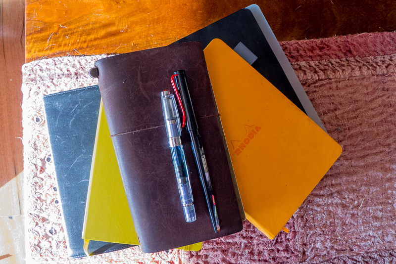
My lovely wife was kind enough to indulge one of my obsessions and buy me a new pen and some ink for Christmas.
I’ve known for a little while that ink sometimes has interesting properties – shading and sheen – sometimes resulting in ink shining, glittering or even changing colour completely from some angles.
But for an ink to show off these properties, it needs pairing with a good paper.
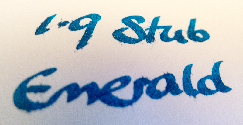
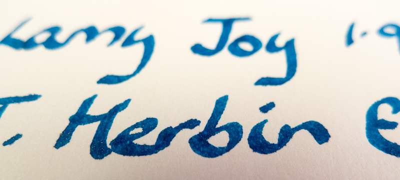
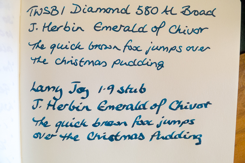
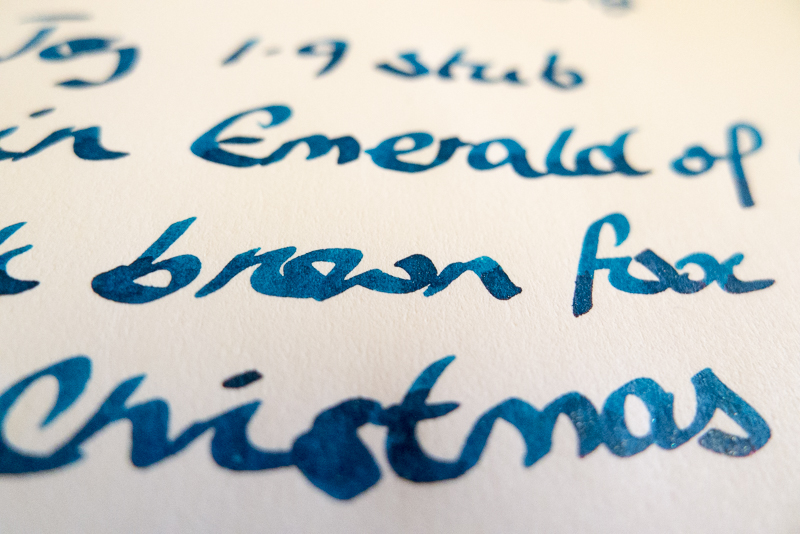
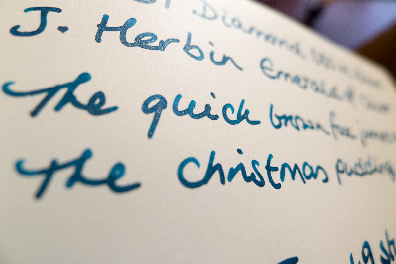
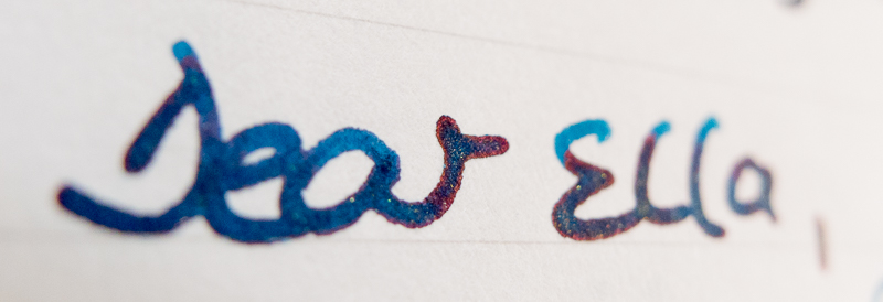
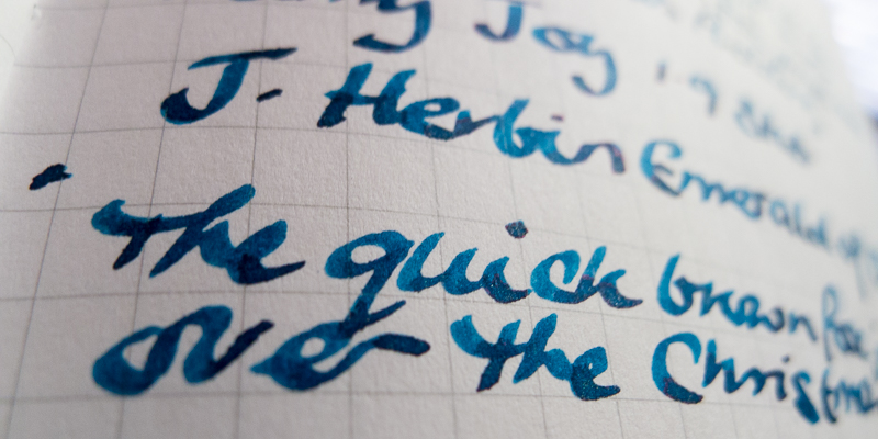
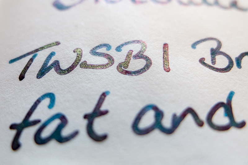
I tried this test with my new ink – J Herbin Emerald of Chivor, my new pen – TWSBI Diamond 580 Al Blue and a more calligraphy friendly Lamy Joy 1.9mm stub (but also included some other pens and inks for good measure)
First up – Moleskine notebook, favoured by writers and noodlers everywhere.
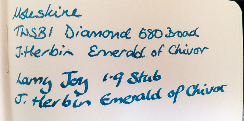
 Oh dear oh dear. It doesn’t work with either the ultra smooth TWSBI Diamond 580 or a big fat Lamy italic nib. In fact, it doesn’t work with any ink or pen I have.
It feathers badly, the paper fibres saturating with ink and making the text fuzzy as it absorbs into the paper. It’s worse with the stub, which actually picks up some of the fibres and drags them around. Ugh.
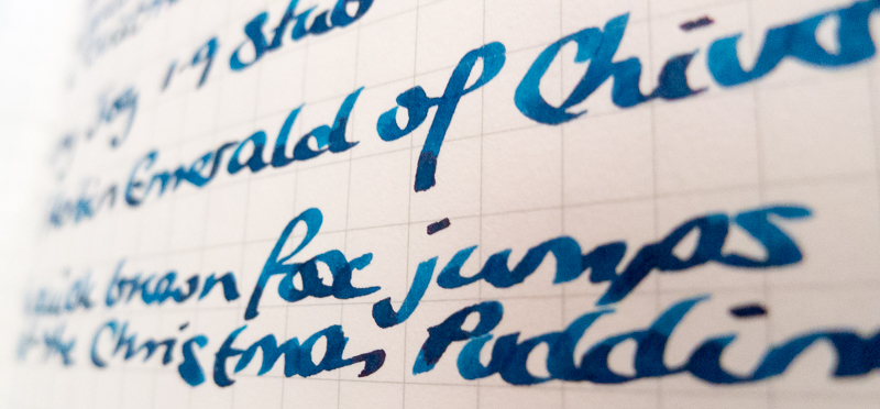
It shows off none of the ink’s character whatsoever (see later on for how this *should* look..) and there is only the barest hint of shading. Even the golden sparkles in the ink are nowhere to be seen.
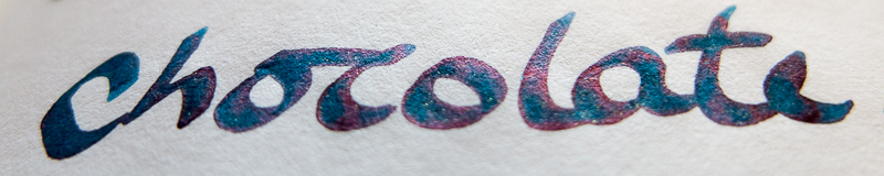
As for the back of the page – hell no. The ink has bled right through (actually onto the next page too..).
Fail.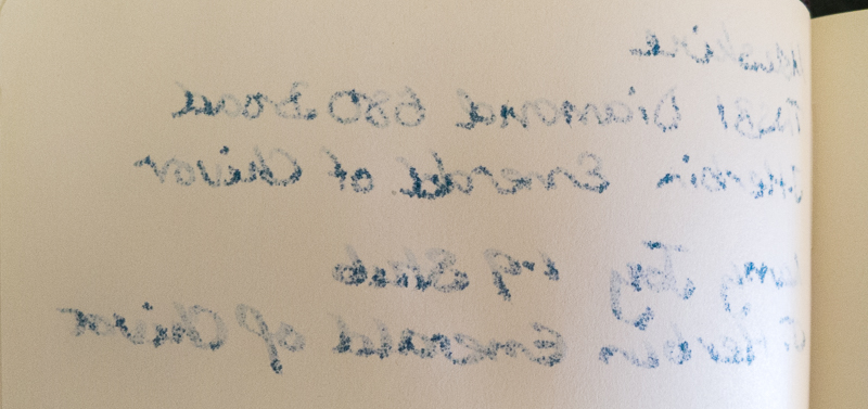
Verdict. 0/10 Regular Moleskines are totally unsuitable for fountain pens. Maybe different inks or pens would have more luck (but experience already says this is unlikely) – I might test this out in another blog, but given how conclusively it failed.
Stick with a rollerball or fibre tip, which work just fine – for this, Moleskines are excellent and you can jot, write and draw to your hearts content.
Next up – Rhodia Webby notebook. These are a step up from a Moleskine with thicker shinier paper – and with some inks, work pretty well.
I got mine from Goulet Pens in the US http://www.gouletpens.com/rhodia-webnotebooks/c/253
The paper is thicker for a start, and on the face of it, smooth and slightly glossy, which bodes well for fountain pen ink.
For the most part though, despite people raving about them in online reviews, I think they are decidedly a miss – you have to be so choosy with ink and nib to get decent response and minimal feathering or bleed through, but mostly the paper feathers and bleeds unpleasantly. If you stick to dry italic nibs (the TWSBI 1.5mm is actually ok with this paper with some less saturated ink like Diamine Ancient Copper) or the best behaved and low saturated inks you have, but even then it’s pretty average. Don’t believe the hype!
This test with the Emerald of Chivor (which to be fair is a very saturated colour) with the TWSBI and Lamy pens did not go so well! There is less feathering, but it’s still there and makes the text pretty average to look at. It’s really not up there with the best papers you can get for fountain pens.


 It also barely allows the ink to show off its potential. There is a hint of what might be, but overall its pretty poor and the effect is very average.
 As for bleedthrough – it’s really poor. Not so different to the Moleskine really. To be fair, other inks fare slightly better, but you do have to pick them carefully. Even though, you won’t be happily journaling on this with a pen and ink.
 It’s not a notebook I would recommend for fountain pen lovers I don’t mind so much not being able to use the back of the paper if the results were stunning in the first place.
Some other inks for comparison (so this test doesn’t destroy Rhodia papers reputation completely!) – this is Sailor Jentle Yama-Dori, which is a beautiful teal ink with a dark red sheen, but also very well behaved, even on crappy paper. Here you can see shading and even a hint of the purple red sheen that it is famous for, but I had to try pretty hard to get it to show at all.
 Lamy black ink is also pretty well behaved – in the broad 1.5mm stub on Rhodia, it holds up pretty well and bleed through is acceptable.
Verdict – 4/10. Like the Moleskine really, only it is just about tolerant to some inks but really, move on, there are better books for you!
Next up, a significant step up – Leuchtturm 1917 Notebook. You can buy these pretty much anywhere – I’ve even seen them in airport stationers. I think we’re beginning to get somewhere now. I really like these notebooks – they are more expensive than both the Rhodia and the Moleskine, but totally worth it if you write a lot.
One place you can get them from is here http://www.notemaker.com.au/leuchtturm1917-master-notebook-plain?default=14491 although I bought mine in Perth from T.Sharp and Co
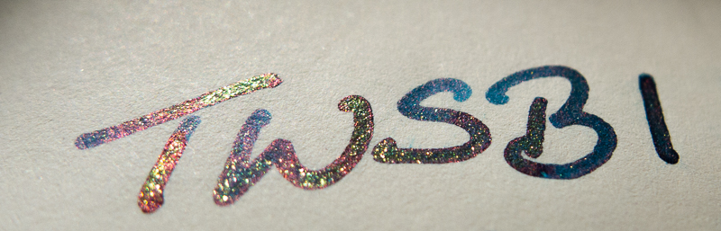
The paper has a much higher resistance to ink which means no feathering – hurrah, at last. Plus, as the absorbancy is lower, we’re starting to get some shading and stable behaviour.

It’s not the best paper in the history of paper – the shading is a bit average (at least with this ink) but for a go to everyday diary or journal for fountain pen fans – you’re in the right territory now.
Ink is starting to shade nicely and you can see more than a hint of the other properties like sheen and sparkle. It’s still not totally brilliant – some inks sheen like maniacs without provocation – with the Leuchtturm1917 paper, you have to look for it a bit.

 Other inks do better – look at the shading on Pilot Iroshizuku Yu-yake. It looks so beautiful on this paper. Noodler’s Apache Sunset would be similar I think.
 No feathering on some very saturated Waterman Violet with a 1.9mm stub
 Even Diamine Sargasso Sea, which is the most saturated ink I own, is good – shading and starts showing signs of the metallic red sheen that it is famous for.
 J Herbin Stormy Grey is no surprise – it’s a pretty well behaved ink and on Leuchtturm1917, it works very well, shading, shining and sparkling perfectly.
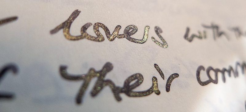 We even see some of the gold sheen on Pilot Iroshizuku Yamo-budo. So this paper can deliver the goods, even if it is a bit subtle.
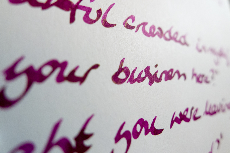
On the downside – it’s pretty good with most inks and I write both sides without too much drama, but it couldn’t totally handle Emerald of Chivor with a little bleed through on the back. A slightly drier nib and you’d probably be ok. It’s fine with other inks.

Verdict – 7/10 – a good solid fountain pen friendly notebook which allows the ink to start to shine. For everyday use – this is up there.
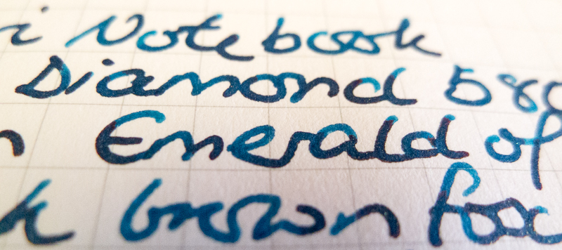
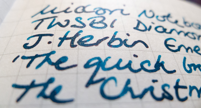
Midori Traveller notebook refills. I use these every day to write to my daughter and for work too (handily, I can expense them 😉 ) – they are awesome for fountain pens – the Japanese really have got quality paper down to an art.
You can get these from lots of places I think we got them from http://www.notemaker.com.au/midori-traveler-s-notebook-refill-ruled-pages?default=2211 Goulet Pens also stock them if you’re in the US.
I’ve never had an issue with feathering, bleeding or anything and they also let the ink properties really come to life. Shading and sheen are easily seen on this paper (although this latest refill is less sheeny than the last one I had, which was much more dramatic)

 Even with these wet nibs, there is no bleedthrough whatsoever.
Verdict 9/10 – can’t get much better than this for every day fountain pen journalling, especially as it slots into the Midori travel system and you can carry it everywhere.
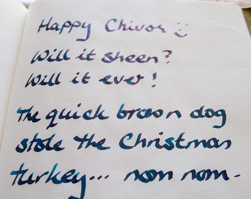
Miquelrius A5 notebook. My wife actually gave me this book – it’s a great big thick tome of a book with 300 hundred pages of tiny grid lined paper. The paper is rather thin, but with the right kind of paper, that is actually no disadvantage for fountain pens.
Get one from here http://www.shopmiquelrius.com/mr-leather-look-journals/
It’s totally feathering resistant – even close up the lines are firm and tight (oh baby) with no feathering at all.
Bleedthrough resistance is really good, not quite as robust as the Midori journals, but there’s no drama writing on both sides of the paper. Indeed, this picture was taken from my daily diary where I had written on both sides with the TWSBI and Emerald of Chivor ink.
The best thing though (and this was what I was expecting from previous experience with the Midori) is how it shows off sheen. Now we’re talking. Emerald of Chivor is famous for having this crazy blue, green red, gold sheen and it does not disappoint here.


Verdict 9/10. An awesome notebook, and pretty cheap too (although this is from this the US, so post, currency to Australia etc will make a dent)
And finally – Midori Light Paper (in the Traveller refill size).
We got it from Notemaker, but as before, Brian and Rachel sell them at GouletPens too, which can’t be overlooked if you’re in the US.
Its tissue thin, very similar to Tomoe River paper (which I don’t have any to compare right now) – you’d think at first glance that it would be awful for fountain pens, but in fact, it’s designed specifically for them. It being so thin is really only for single sided writing – there is zero bleed through but it’s so translucent that it would be difficult to use the other side.

Don’t even give that a second thought though! It comes with 2x as many pages in the refill to compensate and it is outstanding in every other way.
The ink doesn’t feather even a nanometre from the nib and it shows off every facet of the properties from shade to sheen and back again. Inks that previously sat on the page like a stodgy pudding come to life and sparkle.

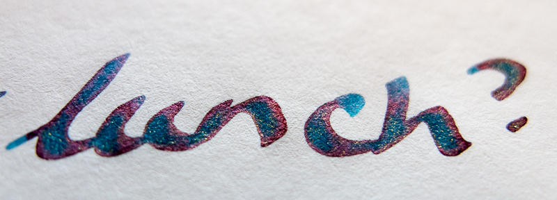


 Just trying out some different light.. Emerald of Chivor is one crazy ink.
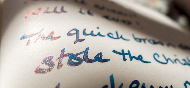
 Here’s some other inks for comparison – Iroshizuku Yama-Budo glitters gold and green..
 Diamine Sargasso Sea shows off its famous red metallic sheen
  Sailor Jentle Oku-yama is beautiful anyway on most paper, especially the regular Midori refills, but shades and sheens green and gold on this Midori Light paper.
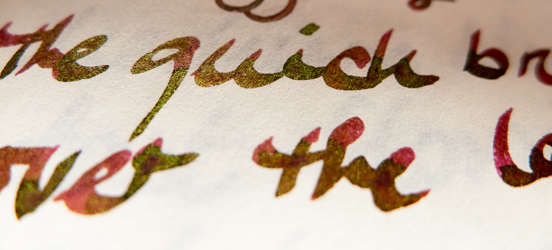 Sailor Yama-dori with it’s teal to red sheen.
Verdict 10/10. Midori Light Paper is awesome for sheeny inks and shows off every nuance from your ink and pens.
So – there ya go -so many other options to copier paper or unsuitable Moleskines – demand better – go seek some Japanese paper!
*note – I also have Kappan Note paper – that’s awesome too – same thickness as Midori regular refills, but sheens and shades more like the Light Paper or Tomoe River.

a delight of a review
LikeLike
I nearly bought a Moleskine notebook on Saturday. Then I read this. Dodged a bullet there! I’ve got a hefty Miquelrius 4-subject that is just about done. It’s played beautifully with my Esterbrooks and Noodler’s Van Gogh Starry Night. I’ve got a bottle of Berning Red on order, and it looks like I just need to pick up another one of these. I’ve got my eye on a couple of TWSBI pens next, and hopefully they’ll play as well with this paper as my current ones do.
LikeLiked by 1 person
Hi 🙂 Yeah, Moleskine is great for some fiber tips or Copic Multiliners, but totally rubbish for fountain pens! You def. dodged a bullet! Good to find another Miquelrius fan! They’re one of the better large journals you can get that work for fountain pens I think – at least of the ones I’ve tried anyways. TWSBIs are really great pens for the money! They aren’t particularly wet writers, so you might find that with a good ink (Sailor Jentle inks have proven to be the best behaved of the inks I have) Leuchtturm1917 notebooks might be a reasonably safe bet too. Good luck!
LikeLike