More inky goodness – sheen and shading
As I previously mentioned in this post – I love fountain pens and the effects that various inks have on different kinds of paper.
Typically, cheap paper just absorbs ink and causes all kinds of nasty effects like feathering (where the line bleeds out and becomes feathered and not clean) and bleed through (where the paper can’t take the ink and it just soaks right through.
When this happens, the other properties of the inks get lost.
But get decent paper and something else happens..
You need a certain kind of paper to show ink properties to their fullest splendour. Japanese papers seem to have it totally nailed.
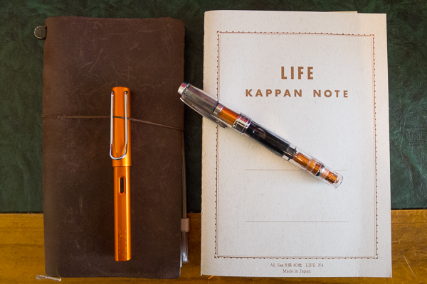
Tomoe River paper, Life Kappan Note paper and the various papers from Midori to name a few are perfect for bringing out the best in your inks.
Firstly, shading. When you write with a pen, the flow of the ink varies with stroke and leaves pleasing variation of saturation. I just dipped a nib into all of my inks, so some of the flow was imperfect – but you see the effect. On crappy paper, you wont see this as the ink will absorb into the paper too much. With good quality paper like Leuchtturm 1917 or Rhodia, it’s designed to cope and the effect is lovely. Why would you write in copier paper with a biro ever again after knowing your writing could look more like this!


Next – sheen. This effect is where the paper type makes the most difference. If the paper is too absorbent, then you wont see any of this. This is on Midori light paper (which is similar to Tomoe River paper) – its very thin, so much so that you wouldn’t believe it would take fountain pen ink at all, but it’s designed for it and although you cant write on both sides (it’s too translucent) – the writing experience is amazing and brings out any sheen in an ink.
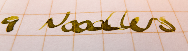
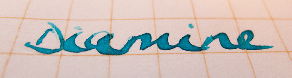
I’ve mentioned Diamine Sargasso Sea before – it’s a deep purply blue that has a gorgeous metallic red sheen when it dries on good paper. You can see it a little on the word Sargasso above on Kappan Note paper, but write on Tomoe River or Midori Light paper and you get an effect that’s spellbinding.

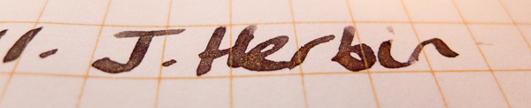
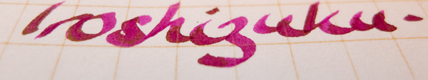
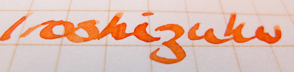
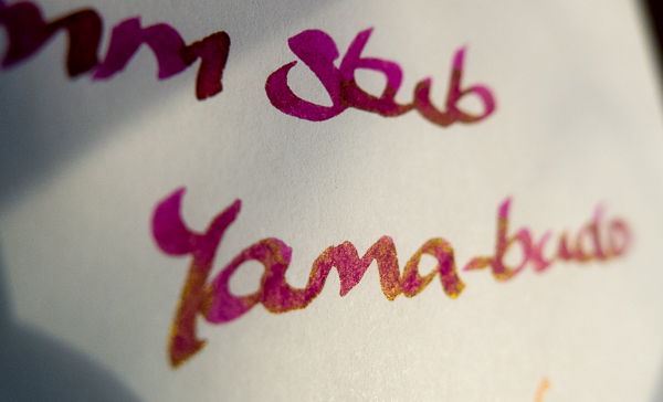
The same goes for Pilot Iroshizuku Yama-Budo. On regular paper, it’s an even magenta. On this paper, it sheens a bright gold. It’s a beautiful nicely lubricated ink that has a habit of bleeding through even good paper like Rhodia, but use proper paper and it’s lovely. The sheen seems to occur on the edges as the ink dries, unlike the blues of Sargasso Sea or Yama-dori below where it occurs on the tail of letters. Beautiful.

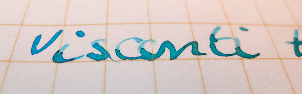
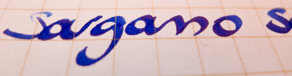
Lastly, Sailor Jentle Yamo-Dori. It’s a teal coloured ink – wonderfully smooth writing and well behaved on almost all paper. It’s a beautiful colour on any medium, but use a wet broad or italic nib and the underlying red pigment starts to who through a little bit as a deep purple hue. On this special paper, it shines through as a vibrant metallic red, particularly where the pen stroke finishes on each letter.


So there you go. There are a ton of inks that do this – mostly blues – Diamine Majestic Blue and Sailor Jentle blue black nano pigment ink are also famous for it.
So put down the biro and copier paper and seek out something better, something more organic and more interesting. Buy some fountain pens and some good paper and see for yourself.
You don’t need to spend a fortune – I only have one expensive pen (thanks Jay), the rest are under $60 and most are in the $30 range. Just watch that your hobby doesn’t spiral out of control.
Just one more pen is okay, right?

I’ve actually never come across a post about ink, paper and pens, but after reading it I feel like using my forgotten fountain pen again!
You’ve got an unusual and interesting hobby 🙂 cool post and nice handwriting!
LikeLike